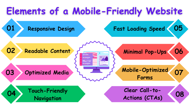
Tejhaksh Technologies is the Website designing & Digital Marketing company based in Neemuch, established in 2020 providing Website design, Website development, Logo design, Domain Registration, Web hosting, Android App Development, eCommerce web development, Search Engine Optimization, Bulk SMS etc. We have good experience in developing different platform websites and we keep our eye on the latest technologies to implement on the website for better conversion and user experience.
In today’s fast-paced digital world, having a mobile-friendly website isn’t a luxury—it’s a necessity. With a significant portion of online traffic coming from mobile devices, businesses must ensure their websites provide a seamless experience across all screen sizes. Whether you’re an entrepreneur, a developer, or a marketer, this guide will help you design a mobile-friendly website that enhances user satisfaction, improves search engine rankings, and boosts conversions.
A mobile-friendly website is a website that adapts to various screen sizes and resolutions, ensuring an optimal browsing experience across devices like smartphones, tablets, and desktops. Key features include:
A mobile-friendly design is more than just good practice—it’s crucial for staying competitive in today’s digital landscape. Here’s why:
1. Enhanced User Experience
Users prefer sites that are easy to navigate and visually appealing on smaller screens. A mobile-friendly site ensures smooth navigation, clear readability, and engaging interactions.
2. Boosted SEO Rankings
Search engines like Google prioritize mobile-friendly websites, especially since implementing mobile-first indexing. A non-optimized site can hurt your rankings and visibility.
3. Increased Engagement
A mobile-friendly site encourages users to explore more pages, spend longer on your site, and engage with your content, ultimately improving conversion rates.
4. Higher Conversions
With streamlined navigation and fast load times, mobile-friendly sites reduce barriers to action, leading to better conversions—whether it’s completing a purchase, signing up, or filling out a form.
5. Competitive Edge
A responsive, user-centric design gives you an advantage over competitors with outdated or poorly optimized sites.
Before diving into the design process, let’s look at the critical components of a mobile-friendly website:
Start by analyzing your target audience to determine their preferences and browsing habits.
Responsive frameworks like Bootstrap and Foundation make it easier to design layouts that adapt to different screen sizes.
Pro Tip: A responsive framework saves time and ensures consistency across devices.
Mobile users prefer clean, intuitive navigation.
Tip: Internal links in your navigation improve site structure and search crawlability.
A slow website irritates users and adversely affects SEO performance.
Quick Fact: Google recommends mobile page load times under 3 seconds.
Content should be easy to read on small screens.
Tip: Optimize your content with long-tail keywords like “how to create a mobile-friendly website.”
Visual content is essential but must be optimized for speed and usability.
Pro Tip: Always test media elements to ensure proper rendering on various devices.
Touchscreens require careful attention to usability.
Quick Fact: Poor touch interaction increases bounce rates and harms SEO.
Testing ensures your website works seamlessly everywhere.
Designing a mobile-friendly website is no longer optional—it’s a necessity in the digital age. By implementing the strategies outlined in this guide, you can create a website that caters to mobile users, improves your search rankings, and drives business growth.
Focus on responsive design, fast load times, and intuitive navigation to deliver an exceptional user experience that keeps visitors coming back. Start optimizing your website today to stay ahead in the competitive online space!
Q1: What tools can I use to test my mobile site?
Ans: Tools like Google’s Mobile-Friendly Test, BrowserStack, and CrossBrowserTesting are excellent for testing responsiveness.
Q2: Do I need a separate mobile site for better performance?
Ans: No, responsive design ensures your website adapts to all devices without needing separate versions.
Q3: How often should I update my mobile-friendly site?
Ans: Regularly update your site to align with changing user needs, technological advancements, and SEO practices.
Q4: Why is responsive design better than a separate mobile site?
Ans: Responsive design adapts automatically to any screen size, offering consistent user experience, whereas separate mobile sites require maintaining two versions.
Q5: Can mobile-friendly design improve conversions?
Ans: Yes, a smooth and optimized mobile experience reduces bounce rates and encourages user engagement, leading to higher conversions.
Q6: What is mobile-first design, and why is it important?
Ans: Mobile-first design starts with optimizing for mobile devices, ensuring essential features work seamlessly for a large mobile audience.
Q7: How do I optimize images for mobile websites?
Ans: Use responsive image techniques, compress files, and convert images to WebP format for faster load times.
Q8: What role does page speed play in mobile SEO?
Ans: Fast page speed improves user experience, lowers bounce rates, and boosts search engine rankings.
Q9: How can I make my website navigation mobile-friendly?
Ans: Use simple, collapsible menus like hamburger menus and ensure touch-friendly clickable elements.
Q10: What are breakpoints in responsive design?
Ans: Breakpoints are specific screen widths where a website layout adjusts to fit different device sizes.
Q11: How do I test for touch-friendly interactions?
Ans: Test on real devices to ensure buttons and elements are large and spaced for easy tapping.
Q12: Can I make my existing website mobile-friendly, or do I need to redesign it?
Ans: Existing sites can be optimized, but outdated designs may require a complete redesign.
Q13: Is mobile-friendly design essential for eCommerce websites?
Ans: Yes, it ensures smooth browsing, faster checkout, and better usability for conversions.
Q14: How do I ensure forms are mobile-friendly?
Ans: Use simple layouts, large input fields, and autofill features for ease of use.
By following these steps, you’ll create a mobile-friendly website that not only ranks well in search engines but also delights users, driving engagement and conversions for your business.
Leave a Comment